Note: if you are searching for the Austrian Business Cycle and landing here, you might be interested in The Dow/Gold Zoom, which is a chart that shows the Dow Jones Industrial Average priced in gold. This might help you to get an idea where we are in the “cycle”.
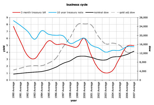
The relationship between short and long term yields and the stock market (and gold) is apparent in this chart. This chart is currently in pdf format. Click the chart itself or the link below.


0 Comments